
Bar chart examples
Real world charts with notes on how they are commented
How to use these charts
In texts not written for teaching purposes (e.g. how to describe a chart), charts are not usually described at all. At most, an important comparison or outlier is pointed out. There may be a short introduction and there may well be extra information in the text which is related to but not included in the chart. There may also be inferences drawn by the author from information in the chart along with comments, opinions, recommendations, or predictions.
To get the most out of these explanations, open the original articles by clicking on the link below each chart. Strictly, bar charts have a horizontal orientation ![]() and column charts a vertical orientation
and column charts a vertical orientation ![]() , but the term bar chart is often used to refer to both categories, which is what we're doing here.
, but the term bar chart is often used to refer to both categories, which is what we're doing here.
Example 1
Bar charts are mainly used for comparison. Sometimes they compare the change of some factor over time in which case the data could just as well be presented on a line graph, as in this example.
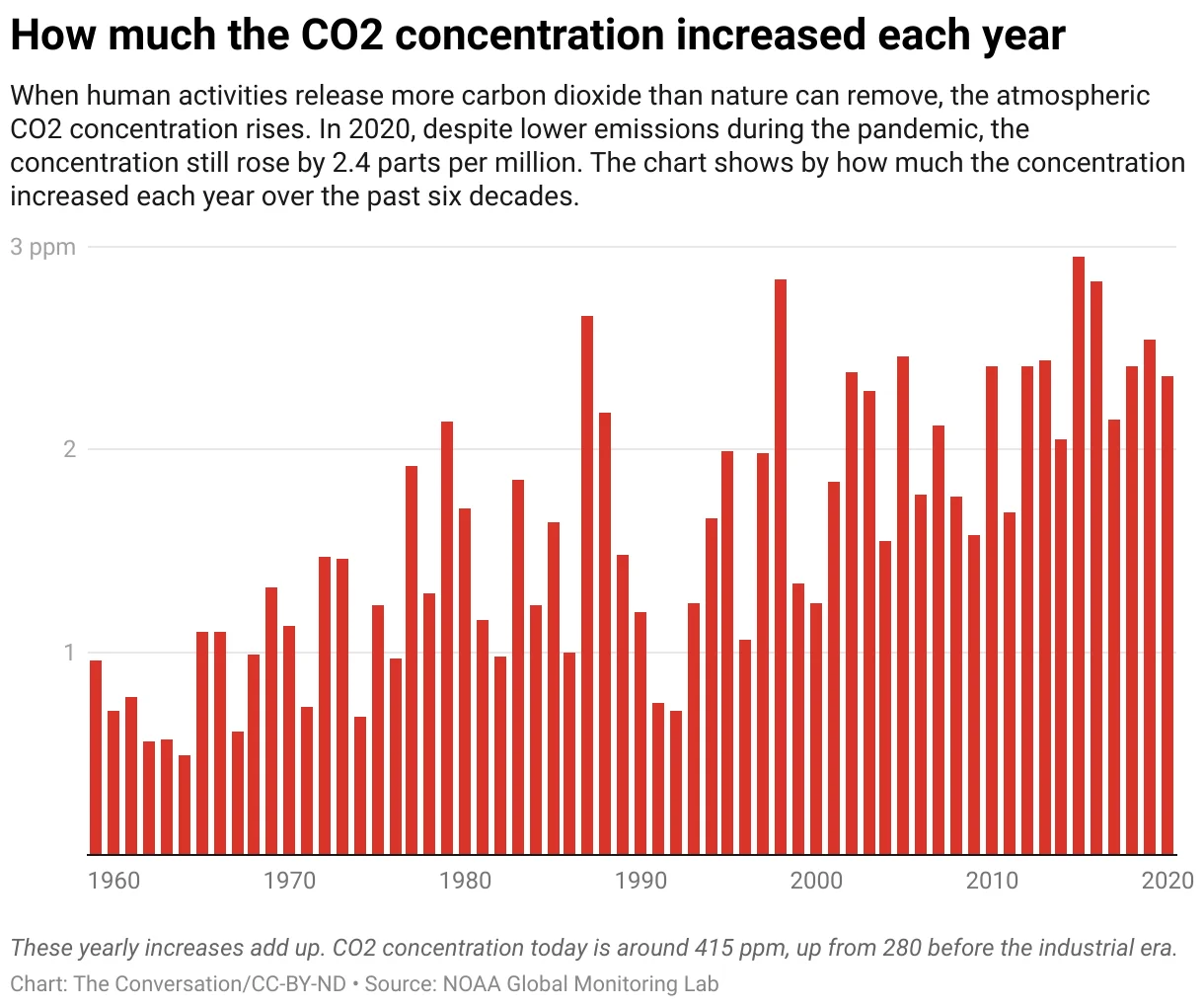
It is extremely important when looking at chart to read the title, the axes, the units and any other information provided on the chart before drawing any conclusions. In this example it is important to understand that chart shows the increase in CO2 concentrations each year and not total concentration levels. There is no zero or negative number on the chart, so we know that there was an increase in CO2 concentrations in the atmosphere every year from 1960 to 2020.
Unusually, the chart has three sentences of explanation below the title including the explicit "The chart shows by how much the [CO2] concentration increased each year over the past six decades". There is also further information below the bar chart which is not contained in the chart itself: "These yearly increases add up. CO2 concentration today is around 415ppm, up from 280 before the industrial era".
The article contains more comment about the chart which you can read in the original article.
Example 2
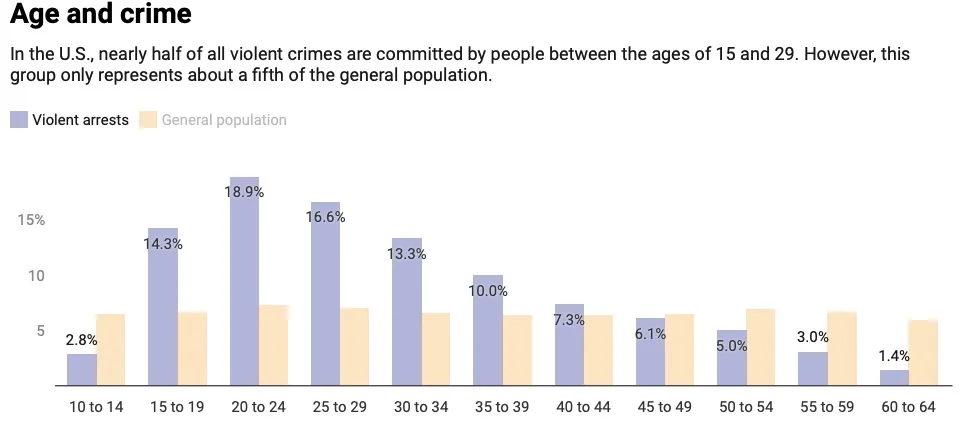
This is a typical use of a column chart showing comparison between two groups, in this case violent arrests and general population, by age group.
You can see that general population for these age groups is very similar. Each age group has roughly the same percentage of the population. But the percentage of violent crime for age group varies considerably.
It is obvious from the chart that the younger age groups above the age of 24 are those where most violent crime is committed. But you'd have to do some arithmetic to know just how much. Luckily, this is done for us in the brief explanation below the title. "...nearly half of all violent crimes are committed by people between the ages of 15 and 29 ". This would be unremarkable if this group represented around half of the population, but this is not the case. They represent "only about a fifth of the general population ".
Example 3
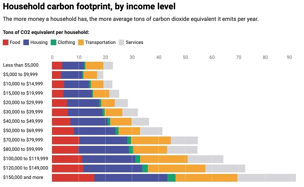
This chart is another good example of how comparisons can be highlighted. Here we have a comparison emission of CO2 caused by various household products according to income level. So we can compare emissions of CO2 both by income and by product.
The graph description tells us: "The more money a household has, the more average tons of carbon dioxide equivalent it emits per year". But from the graph we don't know what period this information refers to. To get this information you need to read the comments in the the original article.
Example 4
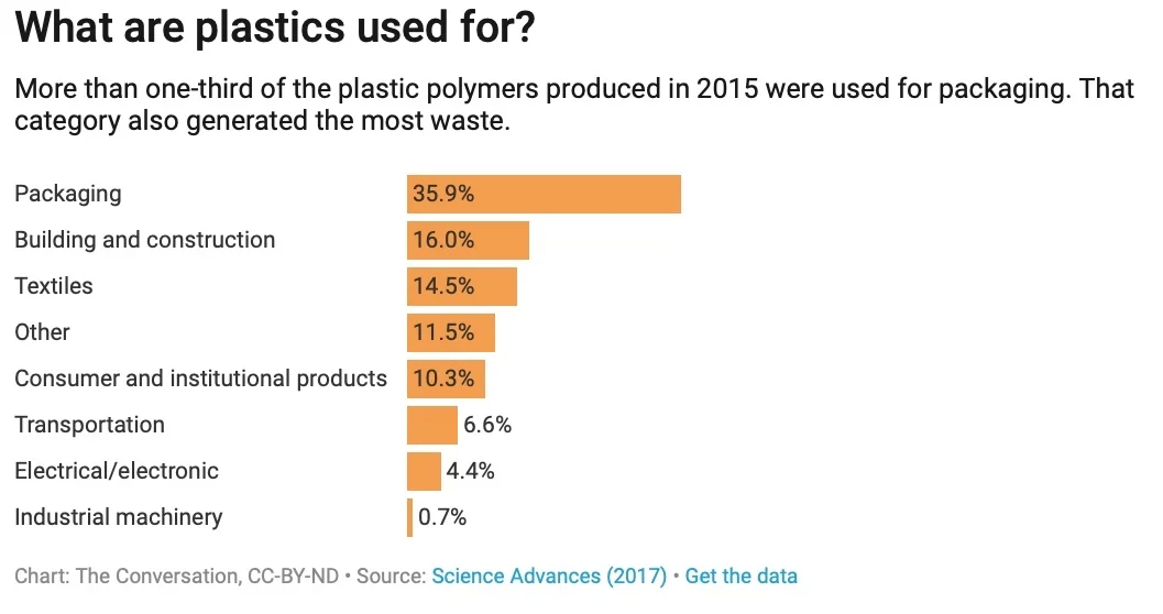
This is one of the simplest types of bar chart, making a simple comparison between the various uses of plastic. It answers the question: "What are plastics used for?". The subtitle also points out the most obvious statistic in the chart: "More than one-third of the plastic polymers produced in 2015 were used for packaging".
There is much more information in the text of the original article so the chart itself functions as a focusSee the glossary definition and a kind of summary of this section of the text.
Example 5
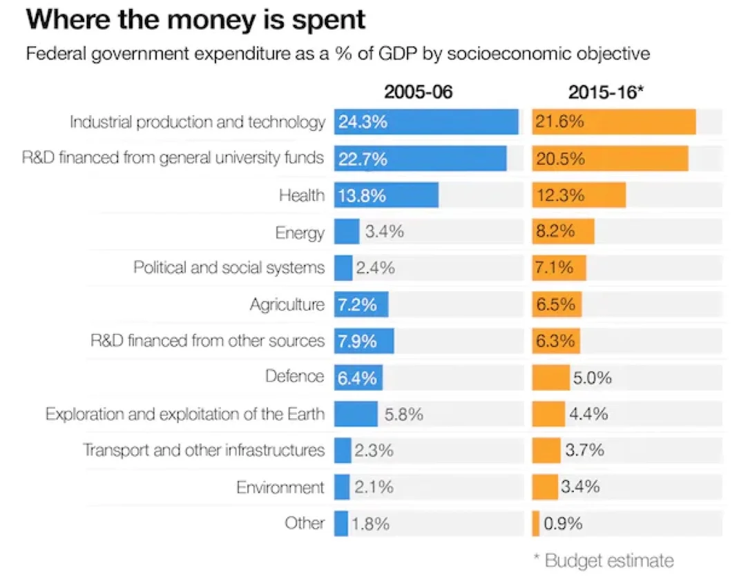
This chart explains where the Australian government spends money for scientific research. This is not clear from the title of the chart because research is not mentioned in the title - you need to read the original text.
Like example 4, this is also a comparison chart involving two comparisons; one between various categories of expenditure and the other between two time periods (2005-06 and 2015-16).
There is only one comment in the text about this chart: "Over the past decade, there have been some minor changes in funding to various areas, although energy has received the greatest proportional increase".
In fact, you can see from the chart that this is the only significant change between the two time periods; a rise from 3.4% to 8.2%.
Example 6
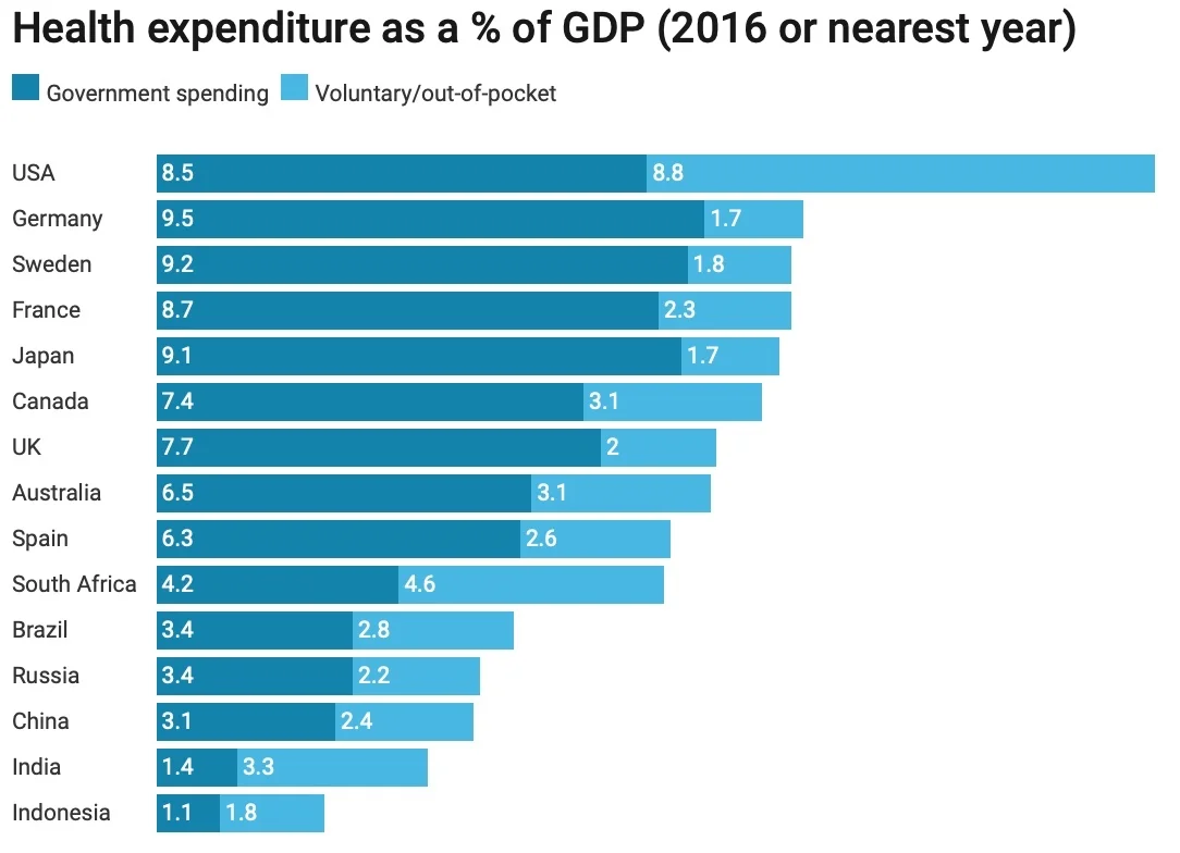
Once again this chart makes two comparisons - health spending in different countries and government spending versus voluntary spending.
The main focus of the text in which this chart is found is on spending on health services in the UK compared to other countries. The chart looks quite simple so it might seem easy to draw some conclusions about whether the UK is getting "good value for money". However, the writer warns: "Unfortunately, these sorts of comparisons are tricky because of the different ways healthcare systems are organised and the various definitions of spending". This is always good advice. Usually charts are designed to present data in an easily understandable format, but this often involves over-simplification of complex data.
If you are a reader, you need to be aware of the dangers of drawing quick conclusions from a chart. If you are a writer you need to be careful abut how you present your data, and supply appropriate caveats where data may have been collected in different ways.